
You’ve locked in your dream website design, you’ve got your branding looking mint and your YouTube history is overtaken by website design tutorials. You’re finally ready to attempt your own DIY website for you small business!
Let’s be real. DIYing your website can feel both empowering and completely overwhelming.
You’re resourceful, driven and just like me (and probably 99% of all other small business owners who are starting small), you’ve taken that leap to build your business website yourself to save on costs or keep things simple. But sometimes, in the midst of designing all the things, it’s easy to miss some key elements that can make or break a new customers’ experience.
If you’re pouring your heart into your business, your website should reflect that same heart. Let’s walk through some common website mistakes many small business owners make, especially when going the DIY route, and how to avoid them.
What Makes a DIY Website Work (and Why Strategy Matters)
Before we dive into what to avoid, let’s talk about what actually makes a website effective.
It’s not just about looking pretty, but about leading your visitors toward action. A high-converting website is clear, easy to navigate, visually consistent, and built with your customer journey in mind. Every section, image, and button should serve a purpose. When strategy and design work together, your website becomes more than a digital space. It becomes a tool for connection, trust, and growth.
Whether you’ve designed your site or about to get started, the following DIY website mistakes are ones that you want to avoid.
Here are six common DIY website mistakes that could be getting in your way and exactly how to fix them.
No. 1: Neglecting SEO Basics
The DIY Website Mistake
Whatever you do, don’t scroll past this step! I know that SEO is the buzz word of the decade, but that’s because SEO matters! SEO, or search engine optimization, sounds intimidating and like it’s just for the tech gurus out there, so it’s often ends up being skipped entirely.
Why SEO matters
Think of SEO as your way of helping people find you. When you’re showing up in search results, you’re there because they are looking for you.
How to avoid it
Start with simple SEO best practices:
- Strategically sprinkle in keywords your audience is actually searching for, like “diy website design,” “faith based business coach” or “Showit templates for creatives”
- Use clear page titles with relevant keywords
- Write unique meta descriptions for each page
- Add alt text to all images describing what’s in the photo
Use AI to help hone in on key words and maximize your SEO. A simple SEO checklist can go a long way in helping your site get discovered. Definitely no tech degree required for setting up your websites’ basic SEO, but it can be the difference between an incredible website, and an incredible website that people actually use.
RELATED: How to Maximize Your Showit SEO: A Guide for Small Business Owners
No. 2: Overlooking your Customer Journey
The DIY Website Mistake
It’s tempting to dive straight into designing because you want to see something beautiful take shape. But without mapping out the journey you want your visitor to take, your site can feel scattered or confusing. How many times have you given up on a website if you can’t quickly and easily navigate and find the things you’re looking for.
As much as we would love to believe that everyone who enters your website is rooting for your small business, the reality is that users are looking for instant access to what they are looking for.
Why your Customer Journey matters
Think of your website like a path. If your audience doesn’t know where to go next, they’ll likely just click away. But a guided journey from “hello” to “how can I work with you” can lead to real connection and conversions. I’m talking every step of the way! From the moment the click into your Instagram links page or when they find you on Google search, they need a simple path to follow.
You need to consider:
- The flow of your home page
Is it clear what you do, who you serve, and how someone can take the next step? Your homepage should lead them to action, not confusion.
- Where each button leads
Are your calls to action intentional? Instead of “Learn More,” guide them with wording like “Start Here,” “View Services,” or “Book Your Session.”
- Your site menu and navigation
Keep it simple. Too many links create overwhelm. Your top menu should include only the most important pages: Home, About, Services, and Contact.
- The order of your pages
Think like your ideal client. What would they want to know first, second, and third? Structure your site in that order.
- Mobile experience
Most visitors will be coming from their phones. Make sure your layout flows well on mobile and buttons are easy to click.
- The final destination
Where do you ultimately want someone to end up? Whether it’s your booking form, email list, or services page, make that clear and easy to get to.
How to avoid it
Before you design anything, think like your customer. Map out the purpose of each page and step. Ask what do I want someone to feel, learn, or do here. A simple journey map, even sketched on paper, can help you build with clarity and peace.
PRO TIP: Want to really nurture your customers? Our FREE Customer Journey Map Template will help you get started in creating a customer journey that actually cares for your customers. Download now to get started.
No. 3: Skipping out on Brand Consistency
The DIY Website Mistake
We all know those websites I’m talking about, you know the ones that looks like a high school project? Fonts, colors, and voice that don’t match across your site can feel disjointed and leave your audience confused about who you are.
Why it matters
You were created with a unique voice and vision. When your branding reflects that consistently, it builds trust and makes your site feel professional and memorable.
How to avoid it
Create a simple style guide. Choose two or three brand fonts, a color palette, and write out a few phrases that capture your brand’s voice. You can start simply by putting your website copy into ChatGPT and asking it to ‘rewrite your website copy with a consistent brand voice.’ Or get creative and provide it with more information about your brand’s vision, mission and/or target audience. Use that information as a prompt to refine your brand voice.
PRO TIP: When it comes to consistent styling, I personally love how Showit makes it easy to keep everything aligned visually with their Design Settings (make sure this if your first step when designing a Showit website) and flexible templates. Want to try Showit? Get your first month of Showit free, on me!
Find out why I simply adore Showit and use it as my go-to for clients.
No. 4: Ignoring Mobile Optimization
The DIY Website Mistake
You design your website on a laptop, but forget to check how it looks on a phone.
Why it matters
More than 60 percent of all website traffic comes from mobile devices, and that number is still growing. Even more compelling, 57 percent of users say they won’t recommend a business with a poorly designed mobile site. That means if your website doesn’t look good or function smoothly on a phone, you’re not just losing clicks—you could be losing trust.
Your website needs to serve your audience where they are, and for most of them, that’s right in the palm of their hand.
How to avoid it
Not all website platforms are built the same. Adopt a mobile-first mindset. That means checking your site on your phone as you build it, not after. Prioritize large, readable text, easy-to-click buttons, and a clean layout that loads quickly.
PRO TIP: One of the game-changers about Showit is that you can design your desktop and mobile views separately, making it easy to give users a great experience across all devices. Takes some extra time, but worth it’s weight in gold having a mobile friendly website.
No. 5: Overloading the Website with Content or Features
The DIY Website Mistake
When you’re building your own site, it’s tempting to add everything—text blocks, images, video backgrounds, sliders, pop-ups, and more. It might feel like you’re adding value, but all those extras can actually weigh down your site and confuse your visitors. Instead of guiding them, your website starts to feel like a cluttered maze.
Why it matters
Did you know that speed and simplicity matter not only for your user experience, but for SEO too. A cluttered, slow site can hurt your rankings in search results—and that means fewer people discovering your business.
How to avoid it
Start by simplifying your layout. Focus on four core pages: Home, About, Services, and Contact. Only include content that supports your message and helps visitors take the next step. Let white space be your friend—it makes everything feel more clear, welcoming, and professional.
Then, test your website using Google PageSpeed Insights. It’s a free tool that shows you how fast your site loads on both desktop and mobile, and it gives specific suggestions on what to improve—like reducing image sizes or removing unnecessary code.
No. 6: Using Low-Quality or Unoptimized Images
The DIY Website Mistake
You find a beautiful photo that perfectly fits your brand’s vibe. You upload it straight to your website. No resizing, no compression, no second thought. But instead of elevating your site, it either looks blurry and pixelated, or it’s so large it slows everything down.
I see this all the time with DIY websites—and honestly, I made this mistake myself in the beginning. Images are powerful, but only when they’re working for you, not against you.
Why it matters
Your visuals are often the very first impression someone gets of your brand. Before they read a single word, they’re scanning your layout, photos, and overall vibe. That means low-quality images instantly create the impression of an amateur site, regardless of how amazing your services are.
From a performance side, unoptimized images are one of the biggest culprits behind slow site speeds, especially on mobile. A single oversized image can tank your load time and frustrate potential clients. And remember: Google takes page speed into account when ranking your site in search results.
So not only can large or blurry images cost you conversions, but they can cost you visibility too.
How to avoid it
Your images are just as valuable as your words on your website. So make sure you take the time to prepare your
Start with high-resolution, professional-quality images
Whether they’re brand photos, stock images, or product shots, make sure they’re crisp and well-lit. Stock image websites, like Unsplash and Pexel give you the option to download smaller versions of the image.
Resize images before uploading
As a rule of thumb, web images should be about 1500 to 2000 pixels wide (depending on placement), and no larger than 300 KB in file size. You can use free tools like TinyPNG or Squoosh to compress them without losing quality.
Use JPGs for photos and PNGs for graphics
JPG files are typically smaller and load faster for photos. Use PNGs only when you need a transparent background or very sharp lines (like logos or icons).
Name your image files with SEO in mind
Instead of uploading “IMG_8392.jpg,” rename it to something descriptive and keyword-rich like “diy-website-mistakes.jpg.” This helps Google understand what’s on your page and can improve your SEO.
Add alt text for accessibility and search engines
Alt text isn’t just for SEO—it’s a way to make your site more inclusive. Describe what’s in the image with clear, helpful language.
My Final Pro-Tip for DIYing a Website for your Business
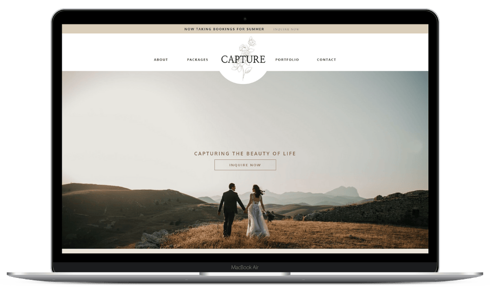
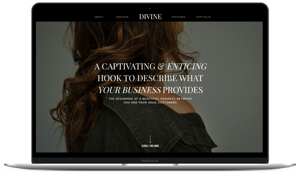
Find the right template! If you’re not a pro website designer, then find a website template that has been created for you already.
PSA: Not all website templates are made equal.
Look out for these 3 things when looking a website template:
- A design that you adore. Remembering that fonts, colours and images will change the vibe, but you want a website that you love!
- A flow that compliments your business. You need a customer journey that fits your business. As tempting as it is, don’t buy a stunning photography website template, if you’re a financial coach!
- Find one that is SEO optimized. Your website might look great, but need one that is built with both form and function in mind.
Fully Loved Showit website templates are built to take the guesswork out of design and strategy. They’re fully customizable, mobile-friendly, and designed with SEO and user flow in mind—so you can launch with confidence and get back to doing what you do best.
Discover Fully Loved Showit Templates for Business Owners
Final Encouragement as you create your DIY Website
Building your own website can feel like a lot, especially when you’re wearing all the hats in your business. It’s easy to second-guess every design choice, every headline, every button. But here’s what I want you to know: you don’t need to be a web designer to create a beautiful, high-converting site that works. You just need the right strategy and a clear plan.
Starting by avoiding these six common mistakes is a powerful step toward building a website that not only looks beautiful but actually works for your business. One that attracts the right people, builds trust, and converts visitors into paying clients.
Where to next: The Tools & Platforms I Use to Run my Online Business